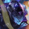
Kidjohnz Posted April 26, 2018 Report Share Posted April 26, 2018 Just finished up a Supremacy jungle themed clan banner. Let me know what you guys think. @Backstabbed is a real easy guy to work with, straight to the point, quick feedbacks, and was patient with the entire process of the illustration. School work and finals had me delay some of the project checkpoints, and even so Phil had no problems with any of the delays, thanks for being so understanding and patient throughout the process. It was a pleasure to work with you and the Supremacy clan to make this! Ir0ny, Break and NiggV 2 1 Link to comment Share on other sites More sharing options...
Guest Posted April 26, 2018 Report Share Posted April 26, 2018 the colors dont blend well, need a darker background i think. drawins looks good tho gj Link to comment Share on other sites More sharing options...
Tuk Posted April 26, 2018 Report Share Posted April 26, 2018 The characters look really amazing again. Just the capes kinda ruin it, a ready logo and font text doesent work in there. Not as high quality as the IR one you did. Kidjohnz 1 Link to comment Share on other sites More sharing options...
Meet Them With Scims Posted April 26, 2018 Report Share Posted April 26, 2018 33 minutes ago, Jimi said: looks ass l0l Link to comment Share on other sites More sharing options...
Killer Kamal Posted April 26, 2018 Report Share Posted April 26, 2018 Really neat and detailed. not a fan of the character style tho , although theres nothign wrong with it they just seem a little goofy Kidjohnz 1 Link to comment Share on other sites More sharing options...
aw panic lol Posted April 26, 2018 Report Share Posted April 26, 2018 Nice af Kidjohnz 1 Link to comment Share on other sites More sharing options...
Fjeder Posted April 26, 2018 Report Share Posted April 26, 2018 looks dope Kidjohnz 1 Link to comment Share on other sites More sharing options...
Jernt Posted April 26, 2018 Report Share Posted April 26, 2018 Cool beans Link to comment Share on other sites More sharing options...
JDM Posted April 26, 2018 Report Share Posted April 26, 2018 i like the banners in the back ground, good touch. Kidjohnz 1 Link to comment Share on other sites More sharing options...
Doc Posted April 26, 2018 Report Share Posted April 26, 2018 init Link to comment Share on other sites More sharing options...
Crusher Posted April 26, 2018 Report Share Posted April 26, 2018 Not my style but gj on making it, very detailed Kidjohnz 1 Link to comment Share on other sites More sharing options...
Public Relations Pig Posted April 26, 2018 Report Share Posted April 26, 2018 agree they're all 30 years old irl l0l Dont 1 Link to comment Share on other sites More sharing options...
Ace Krave Posted April 26, 2018 Report Share Posted April 26, 2018 looks like a picture Link to comment Share on other sites More sharing options...
Lionel Posted April 26, 2018 Report Share Posted April 26, 2018 its really good man, the first responders arent even capable of drawing within the lines so dont worry about them. Kidjohnz 1 Link to comment Share on other sites More sharing options...
Salso Posted April 26, 2018 Report Share Posted April 26, 2018 One guy holds his bow the wrong way and the team capes look poop, other than that nice job Kidjohnz 1 Link to comment Share on other sites More sharing options...
Colly Posted April 26, 2018 Report Share Posted April 26, 2018 Think you did a very good job bro. well done! Link to comment Share on other sites More sharing options...
Mustafa Posted April 26, 2018 Report Share Posted April 26, 2018 Different and good, thanks for the services Link to comment Share on other sites More sharing options...
Dr Mengele Posted April 26, 2018 Report Share Posted April 26, 2018 yeaaa they look good Link to comment Share on other sites More sharing options...
Grabbin Posted April 26, 2018 Report Share Posted April 26, 2018 Looks good, but I agree, the background should/could have been a bit darker, also ya not sure about the banner in the background - maybe you could've integrated the logo into the background somehow, not sure. Again, nice job tho Link to comment Share on other sites More sharing options...
Colin Posted April 26, 2018 Report Share Posted April 26, 2018 Get rid of the capes Link to comment Share on other sites More sharing options...
Break Posted April 26, 2018 Report Share Posted April 26, 2018 I like it! The one criticism I have is to adjust the supremacy banners in the back, it seems to be a folding/flowing texture but the supremacy tiger/text aren't being warped to mimic that. Other than that, this is a really nice piece Link to comment Share on other sites More sharing options...
Fazing Posted April 26, 2018 Report Share Posted April 26, 2018 good brown sticky stuff Link to comment Share on other sites More sharing options...
NiggV Posted April 26, 2018 Report Share Posted April 26, 2018 looks nice Link to comment Share on other sites More sharing options...
Ir0ny Posted April 26, 2018 Report Share Posted April 26, 2018 Always good to look at this sort of art. Anything that is different in this community is often shunned but looks dope imo. Keep it up Link to comment Share on other sites More sharing options...
Sybren Posted April 26, 2018 Report Share Posted April 26, 2018 12 minutes ago, Ir0ny said: Always good to look at this sort of art. Anything that is different in this community is often shunned but looks dope imo. Keep it up Exactly what I was going to write But in a 4n way Ir0ny 1 Link to comment Share on other sites More sharing options...
Recommended Posts
Create an account or sign in to comment
You need to be a member in order to leave a comment
Create an account
Sign up for a new account in our community. It's easy!
Register a new accountSign in
Already have an account? Sign in here.
Sign In Now